REBOOKED - Brainstation Capstone project
Finding calm in the chaos of flight disruptions

Role
UX/UI Designer
Timeline
July 2024 – September 2025
Team
1 Designer (capstone)
Skills
User Research
Usability Testing
Branding
Design Systems
Overview
Designing calm into travel's most stressful moment
Travelers are constantly missing connections and reservations due to delays, but the real problem is not the wait. It is the lack of guidance. I chose this problem space because I saw a critical need to reduce the unnecessary stress, time, and financial burden placed on individuals when flights go wrong.

I designed Rebooked, a mobile app that helps travelers efficiently manage disruptions. Over this three month capstone, I took full ownership of the design process, from research to a high fidelity prototype, to create a solution that streamlines rebooking and minimizes financial loss.
the emotional toll
Listening to travelers in crisis through user interviews
I conducted user interviews with frustrated travelers to map their emotional journey throughout a disruption. Synthesizing this data into an affinity map revealed three core themes causing the most significant stress:
THEME 1
A lack of communication
Travelers felt anxious and powerless when left in the dark, unable to make quick, informed decisions about their connections, hotels, and plans.
THEME 2
Feeling abandoned
A profound frustration with the lack of adequate support from airlines left travelers feeling like they were on their own to solve a complex logistical problem.
THEME 3
The financial burden
Opaque and unfair compensation processes added a layer of financial stress on top of an already emotionally draining situation.
Key insight: Travelers felt abandoned, spending hours on hold manually replanning. They needed clarity and control to protect their time and money.
Synthesizing insights from user interviews, I mapped a common journey to understand the emotional and logistical toll of flight disruptions. This led to the creation of a primary persona:

Meet Chris, a frequent business traveler. His demanding schedule is constantly derailed by flight disruptions, creating stressful conflicts between last-minute rebooking and his professional and family commitments.
How might we help airline travelers efficiently manage bookings affected by flight disruptions?
DEFINING THE STRATEGY
Travelers are forced to juggle multiple apps and airline policies alone. This experience could be transformed by providing a clear overview of the disruption and a step-by-step path to reassemble their trip.
For this project, I focused on a core MVP: the hotel rebooking experience. I designed a flow that demonstrates how the app would automatically identify affected hotel bookings when a flight is delayed, and then guide the user through the steps of modifying or rebooking their stay.
REFining the flow
Refining language and flow to eliminate user confusion
This initial concept evolved significantly through two rounds of usability testing with five participants each. The initial design suffered from two key issues: a vague primary action label ('Modify') and an overwhelming number of choices presented too soon.

Pivot: Usability testing revealed critical gaps in clarity and feedback. I changed 'Modify' to 'Update Booking' to better set expectations and improved visibility by adding status indicators for affected plans and confirmation alerts for changes.
A second round of testing confirmed that users still wanted full manual control, so I ensured the auto-update feature complemented—rather than replaced—the ability to make custom edits.

This refinement in language, structure, and placement eliminated initial confusion and allowed users to proceed with confidence.

Shaping the Visual Identity
Design system and sketching logos
I developed a visual language and design system ('Tarmac') focused on calm and clarity. I chose a serene color palette and clean typography to directly counter the user's anxiety.
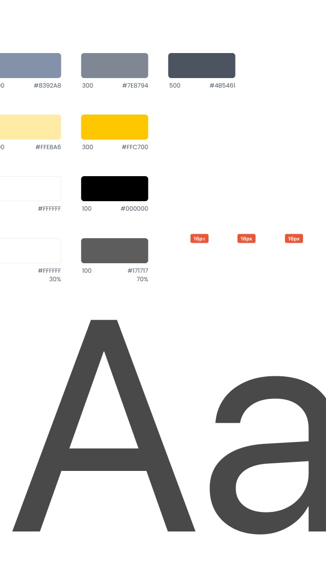
Foundations
Typography, Grids, Colors
"I like being a freelancer because you get to work on diverse projects. It’s learning about different subjects that I really enjoy."
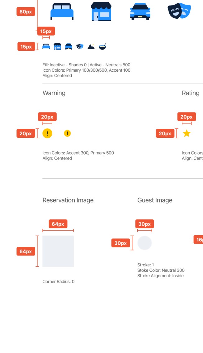
Atoms
Iconography, Buttons, Inputs, Controls
Elemental building blocks of the interface.
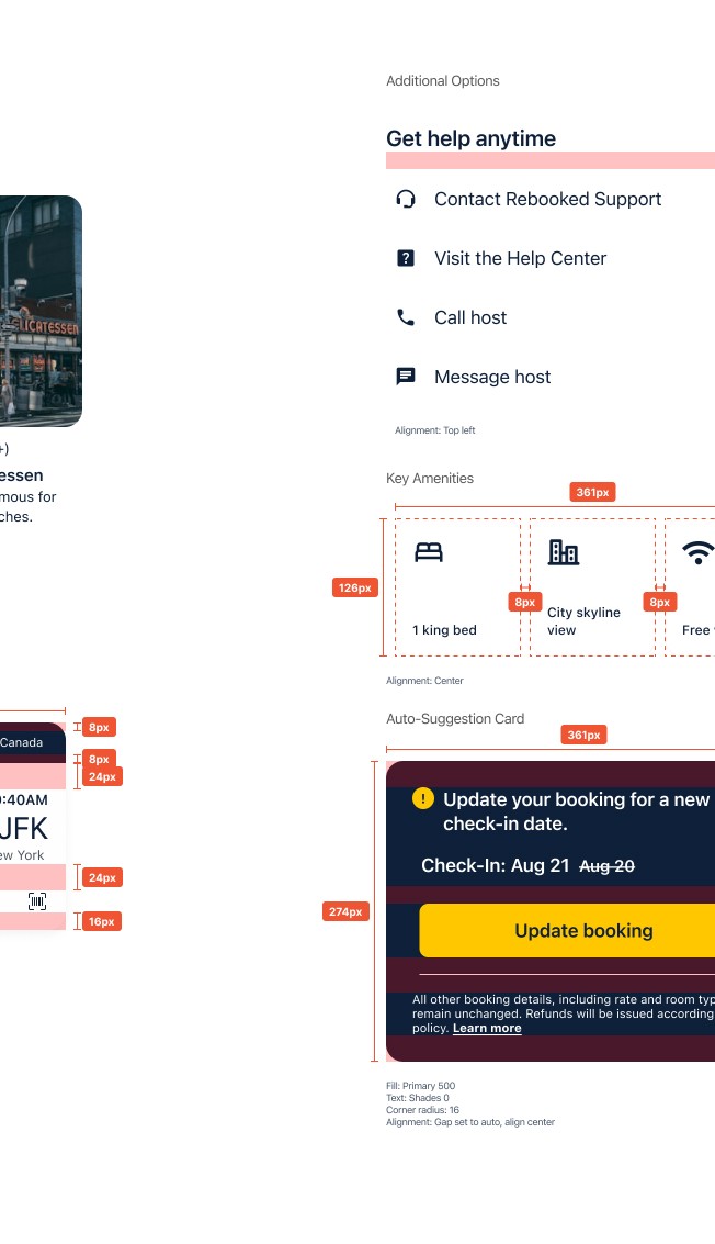
Components
Actions, Containers, Selection, Navigation
Interactive building blocks of the interface.

From Chaos to Control
A frictionless path from interest to investment

Feature 1: A Centralized Travel Hub
All upcoming bookings—flights, hotels, and rentals—are integrated into a single, clear overview, eliminating the stress of juggling multiple apps and confirmations.
Feature 2: Smart Disruption Alerts
The app automatically identifies which reservations are affected by a delay, visually highlighting them and providing a clear starting point to manage changes.


Feature 3: One-Click Value Recovery
Users can instantly apply an optimal update to their booking to maximize value (e.g., refund, reschedule), while retaining full freedom to make manual adjustments if preferred.
Key learnings
I learned that designing for users requires speaking to them directly, even if you believe you already understand their problem from your own experience.
User interviews revealed critical insights I never could have anticipated.
I learned that while everyone's travel disruption story is unique, the feeling of being abandoned by the system is universal. User interviews verified my assumption about stress and financial burden, but they also revealed the deeper, common need for centralized control and guidance, which became the true north for my design.
Usability testing revealed that confusion is a design opportunity, not a failure.
Usability testing taught me that confusion isn't a failure—it's a design opportunity. Every moment of user hesitation highlighted where I could better signify intent and translate complexity into clarity through interaction design.
