Redesigning the end-to-end UX and branding for a fitness program, increasing conversions by 7%
As the lead designer, I owned the end-to-end transformation of a fitness brand from initial concept to execution. For a nutrition coach with 75K+ Instagram followers, I completely redesigned the brand identity and digital experience - moving from a founder-focused aesthetic to a professional, client-centric approach.
My work encompassed developing a new visual language, rebuilding the website with accessibility-compliant interfaces (WCAG 2.0), and optimizing the conversion funnel through strategic UX improvements.
Achievements
Drove a 7% conversion lift by rebranding to a client-first approach and streamlining the sign-up journey, while implementing accessible design standards and maintaining lead quality.
Role
UX/UI Designer
Skills
Product Design
Brand-to-Business Alignment
Stakeholder Leadership
Branding
Timeline
December 2024 - May 2025
The Challenge
Shifting focus from founder to brand
One of the primary objectives was to reduce the founder’s personal presence in the program’s branding. Previously, the program was heavily centered around him, but this time, the focus needed to shift toward RC Fitness as its own entity.
While this strategic shift was the client’s priority, I wanted to ground the redesign in measurable outcomes by applying the HEART framework to define success metrics for this phase.
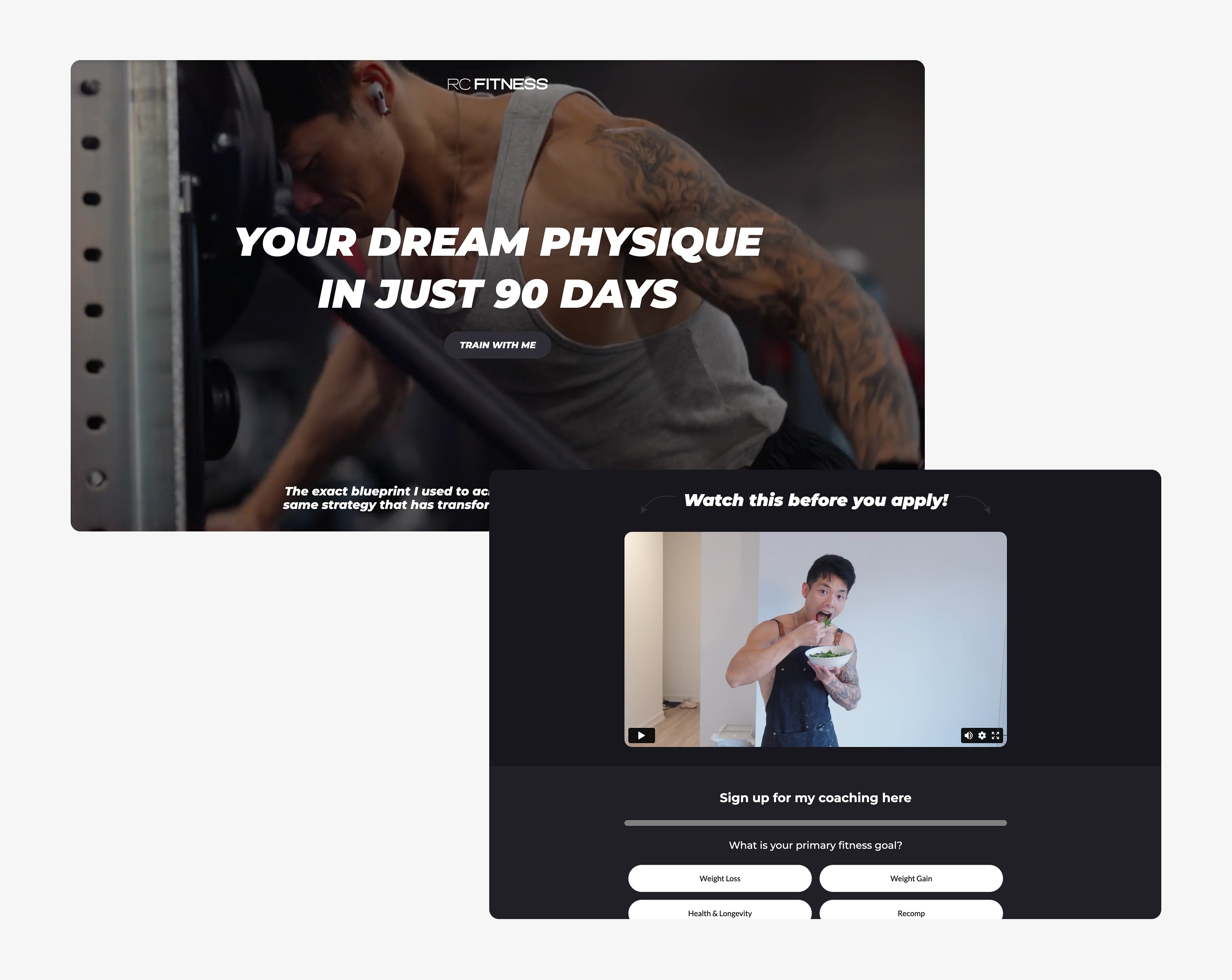
Before: Founder-centric website using language such as 'my coaching' and 'train with me,' lacking user-focused messaging.
After: Evolved the branding to speak directly to users while keeping the founder’s voice.
Client Discovery
How I diagnosed RC Fitness’ conversion leaks through stakeholder interviews
Through stakeholder interviews, I identified three critical UX challenges that were hindering conversions:
1) Reducing friction in lead capture
The existing form was buried below the hero section, creating unnecessary steps for users. Yet, this form acted as the primary prescreening tool to filter unqualified leads before sales calls.
2) Build trust in flexibility
Clients needed proof that the program worked without restrictive diets and reassurance that coaching would adapt to their lifestyle.
3) Clarifying the program's unique value
The founder’s influencer presence overshadowed the program’s standalone benefits, leaving users unsure why to commit.
Know the User
Clients who want a quick physique transformation without following a restrictive diet.
Goals
Clearly articulate the program’s value proposition and unique differentiators.
Approach
Cut through the noise: clarify the offer, prove it works, and remove sign-up friction.
How might we increase sign-ups by shifting trust from founder to program?
A Broader View
First, I mapped the end-to-end client journey from discovery to program completion
Before designing the sign-up process, I analyzed the client’s end-to-end journey to ensure the UX aligned with both user needs and stakeholder requirements. This research allowed me to craft a marketing site that accurately mirrored the user experience while proactively addressing potential friction points before development.
Initial Sign-Up User Journey
From skeptical follower to confident client in 90 days
I created Scott—a longtime follower of the founder’s fitness content—to model the ideal user journey. Like most potential clients, he arrives with two priorities: proving the program delivers real physique changes (without restrictive diets) and justifying the investment.
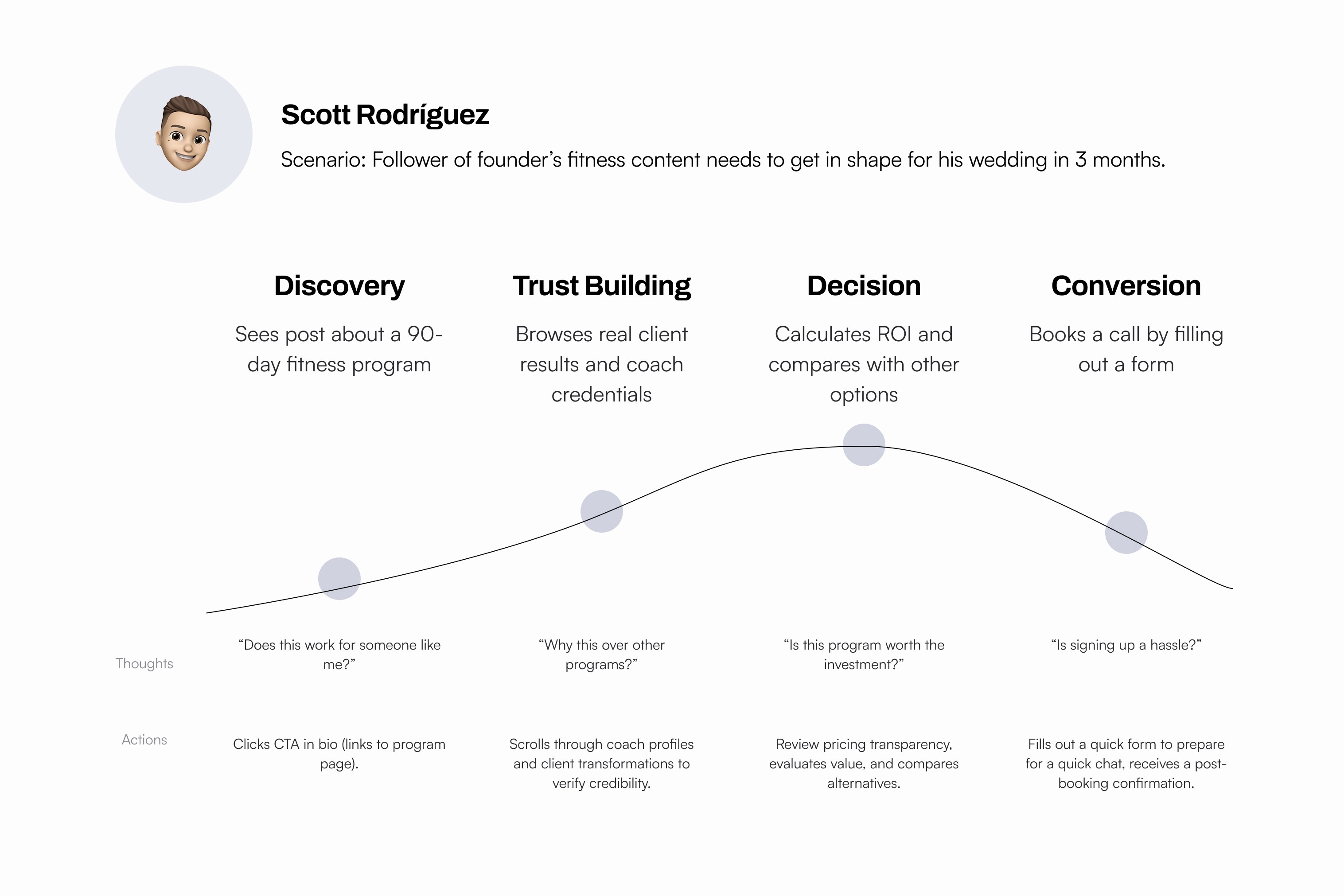
In redesigning this program, I prioritized clear messaging that highlights client benefits. This ensures users can make well-informed decisions when filling out the initial sign-up form.
Conflict & Realignment
Designing a middle ground
Early discussions revealed pricing transparency as a critical conversion factor - though my client strongly resisted displaying costs upfront.
To bridge this gap, I reframed the value proposition to position RC Fitness as 'the affordable middle ground' between impersonal apps and high-end trainers, while strategically deferring exact pricing to the booking call.

Before: Users had to click 'Sign Up' to learn it was a paid program on the fourth question. No mention of pricing.
Branding
Before: A lack of strategic brand identity
During the initial brand audit, I identified three critical flaws undermining their identity: 1) A generic stock logo that failed to communicate brand values, 2) An inaccessible yellow/white/black palette creating legibility issues, and 3) Chaotic typography with no clear hierarchy.

After: Intentional, client-centric branding
I created a modern fitness brand focused on communicating the 90 day program's personalized approach. Every element was designed to show genuine care for clients, from the clean visual style to WCAG 2.0 compliant accessible typography. While distinct from the client's personal brand, the new identity takes cues from client focused companies like Lululemon and On Running. The result is a professional, cohesive system where every detail builds trust and reflects the program's values.

Key Features
Feature #1: Optimizing the homepage for call conversions
I designed the homepage to drive call bookings while balancing the client’s needs with UX best practices. Rather than leading with testimonials (as the client initially wanted), I prioritized a clear value proposition to immediately communicate the program’s uniqueness. A sticky CTA ensures users can act as soon as they’re convinced, and streamlined copy reduces friction by answering key questions upfront.

One constraint was showcasing the external Everfit app. Without access to professional screenshots, I kept app references minimal for now. This serves as a temporary solution until the client develops a dedicated app that can be highlighted more prominently.
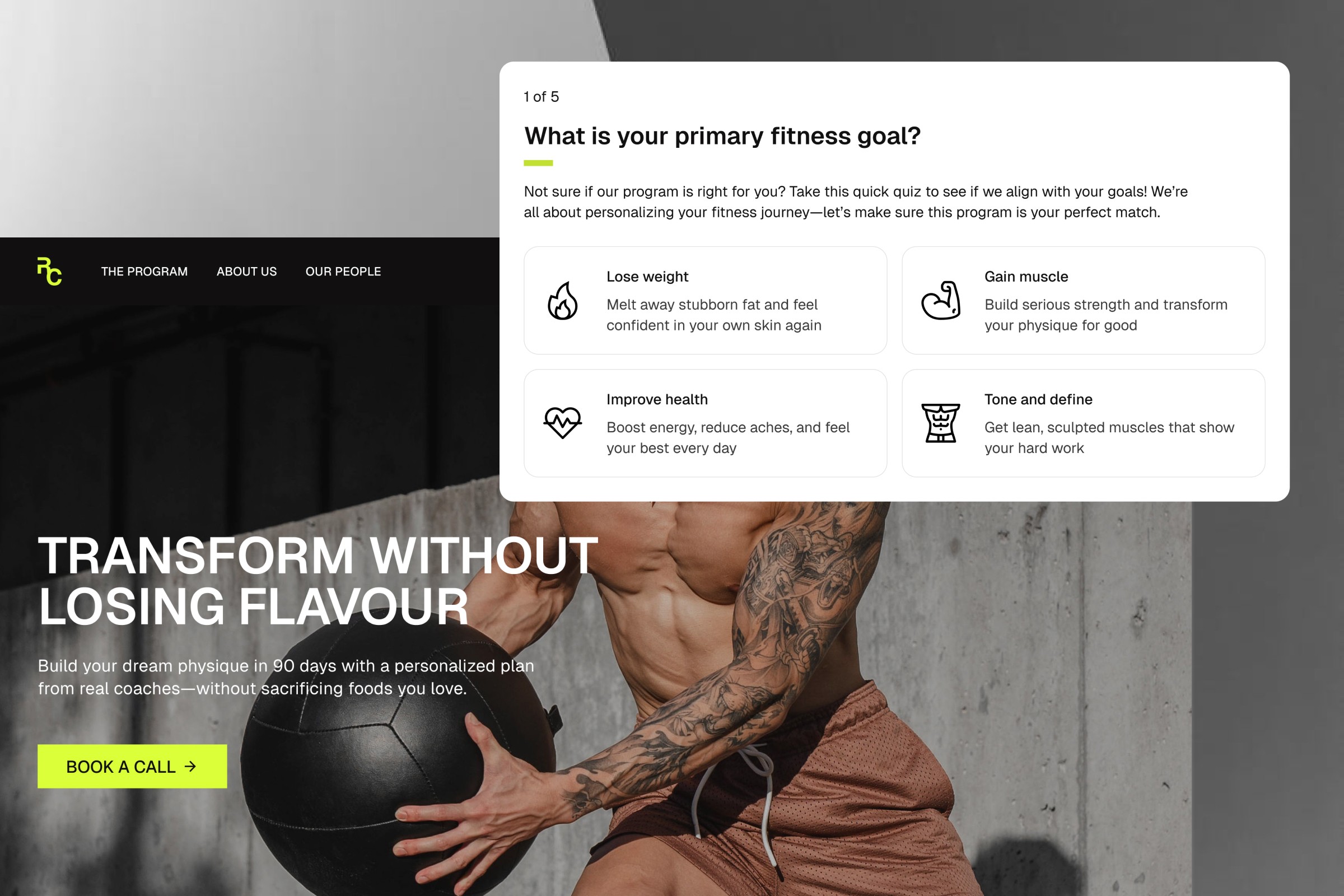
Feature #2: Simple yet effective sign-up form
I transformed the clunky multi-step form into an intuitive experience that auto-advances users through strategic qualifying questions - eliminating unnecessary "Next" clicks and text fields while adding clear page numbers and icons. This streamlined version maintains the client's crucial lead-filtering function (proven effective through their A/B tests) while making applicants feel genuinely understood through questions that give coaches just enough insight to personalize consultations.

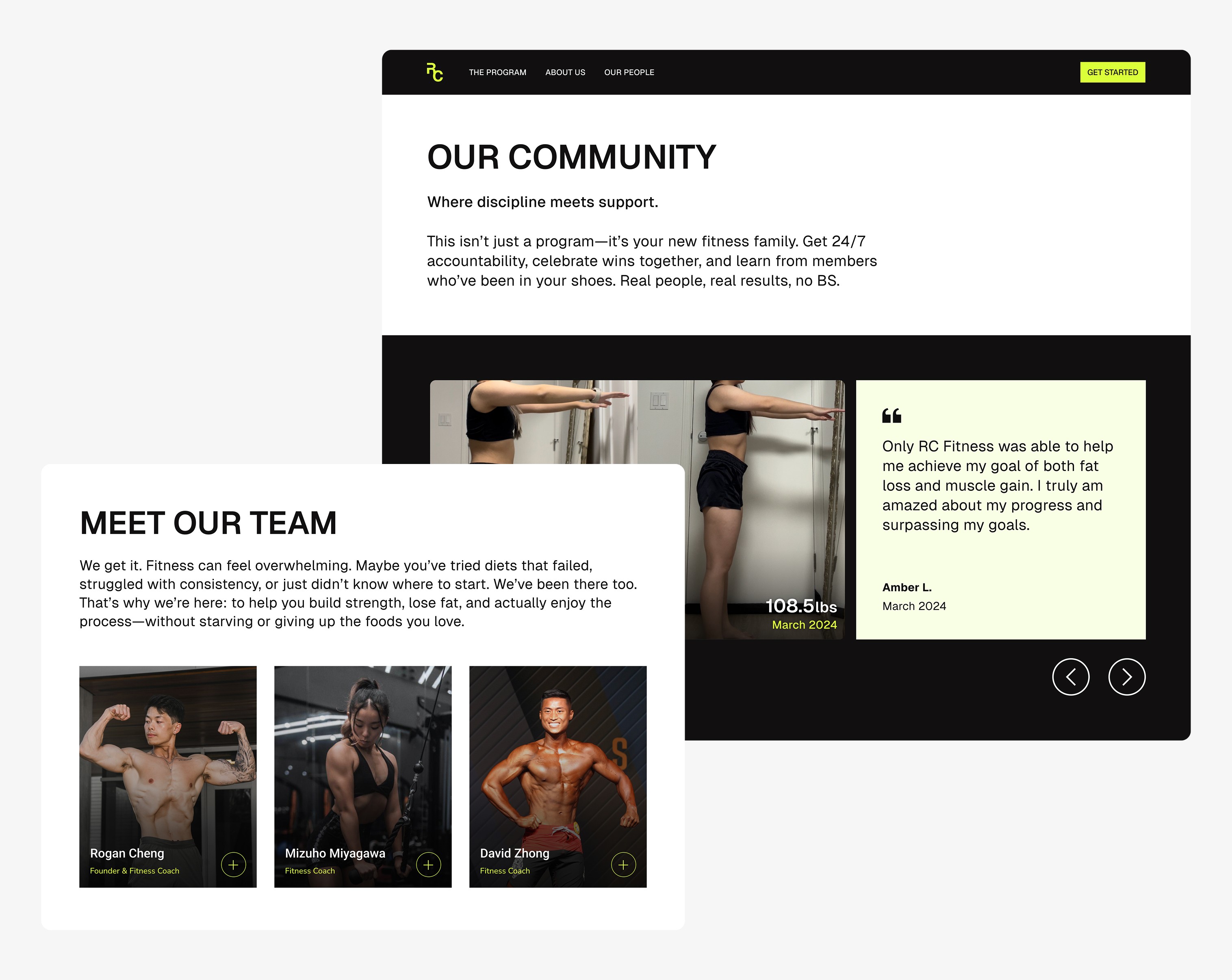
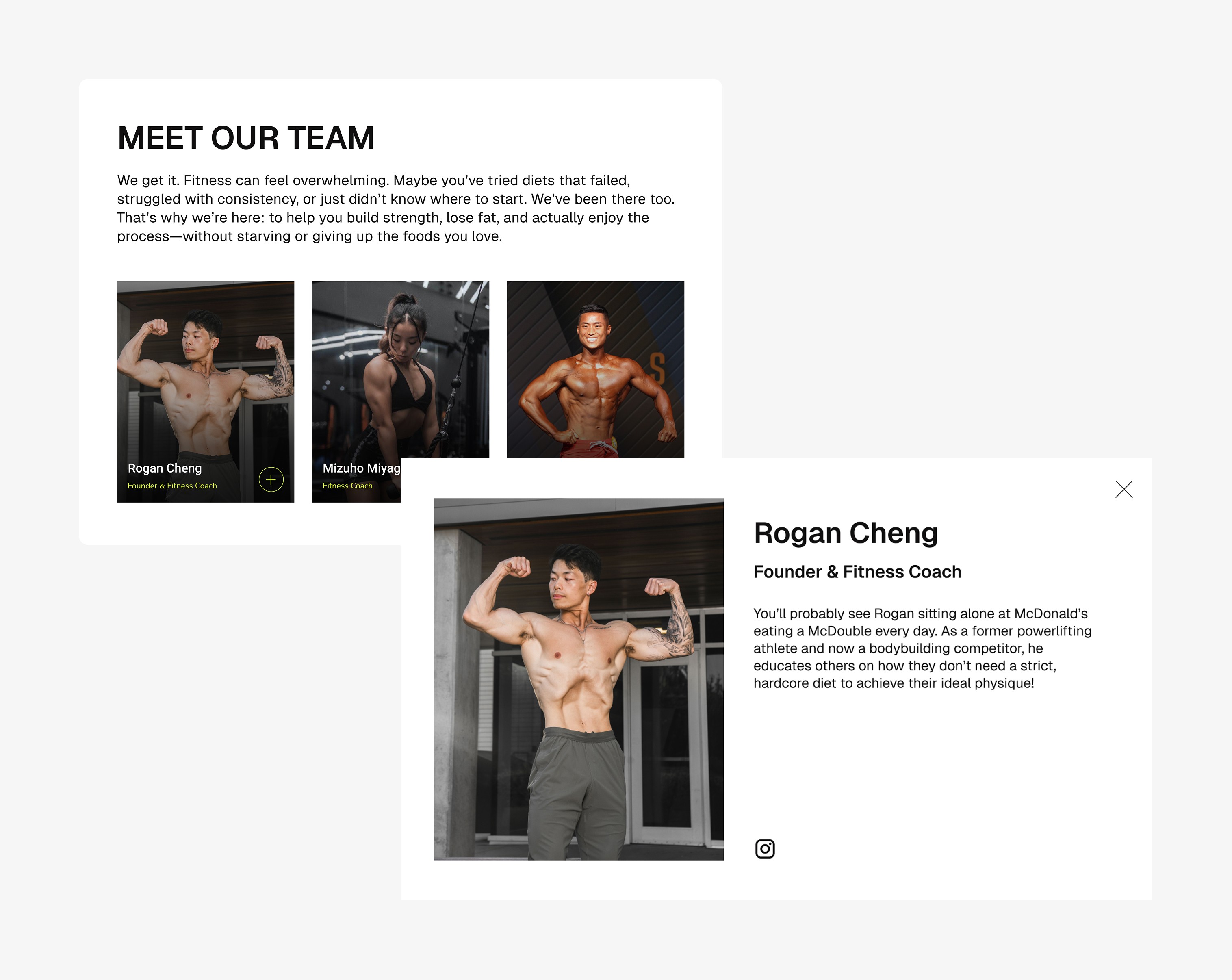
Feature #3: Spotlighting trainers and transformations
I prioritized showcasing trainer expertise and client success stories because social proof builds trust. When prospects see real people achieving results, they visualize their own potential, reducing hesitation before signing up. By balancing professional credentials with relatable transformations, we can address both the logical and psychological barriers to conversion.

The Impact
By aligning the brand, form UX, and content strategy, I turned a confusing process into a clear path where users feel confident committing to the 90-day program.
I reduced drop-off points by 1) answering critical ‘why join?’ questions through strategic messaging, 2) streamlining the form to feel effortless yet effective at filtering leads, and 3) rebranding around client outcomes—not the founder—to build trust and clarity at every touchpoint.
As the designer, I shifted the brand focus from the founder to client success stories, simplified the sign up form to reduce friction, and clarified the program messaging to help users make confident decisions. The result was a more professional, trustworthy experience that converted better.
Design
Isanna Wong
Client
RC Fitness